

Please take the time to vote on how much you like the images below. Thank you in advance for your feedback. It really helps my to continue to push the envelope and improve. Resulting in even better renders for you, the clients.
Le Farfalle
Le Farfalle, is a bed & breakfast/guest house on the shores of Lago di Garda (Lake Garda) in Northern Italy.
Wayne and his fiancé, Vicky, I were fortunate enough to be able to take a month out for her (special birthday) and decided to VW camper van it to the northern lakes passing through 9 countries altogether they we circled back to the UK. Although they enjoyed the camper van, they also decided that they needed a little pampering and so stayed at a few hotels and bed & breakfast along the way. Le Farfalle, was one of these wonderful places, and one of the best too. Such a lovely host and a fantastic location.
Upon his return to the UK Wayne produced this work for Louise, the owner, for her to hang in the property and/or utilise the image files in her promotional literature if desired.
Louise's response to the work was fantastic. She said "Congrats, they are beautiful!!!" and added that her husband was also very happy with the images.
Below is the original plan view as an individual image; notice the subtle differences between this and the final image (see the layout further below) for example, Note the accented roof.
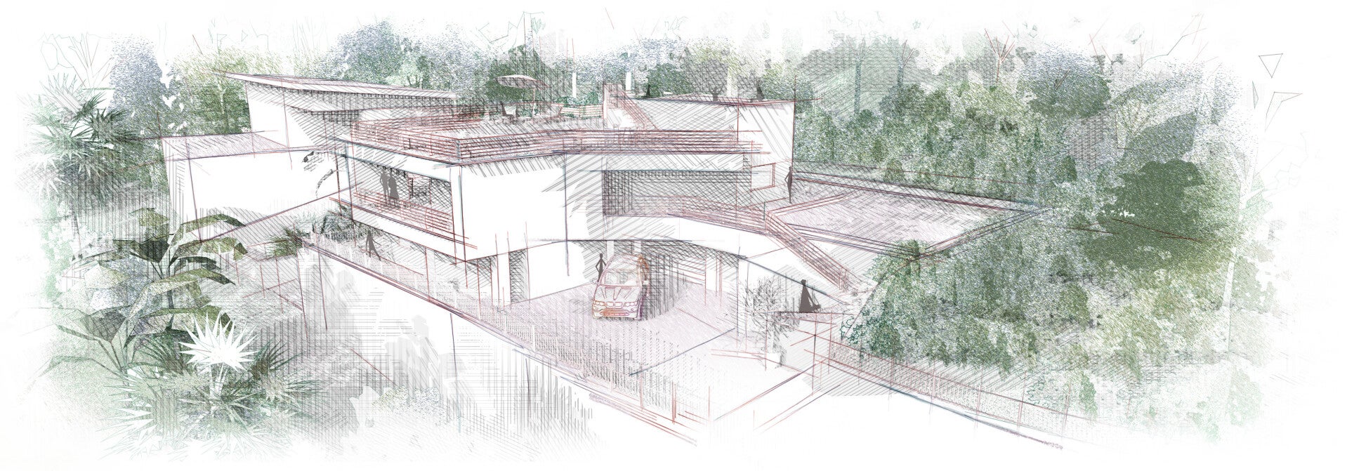
Below, is the original axonometric view. As with the previous example some minor adjustments were made before setting the image into the layout for presentation.

The image below is set out as a layout presentation sheet, showing an axonometric view and a plan view, highlighting the property's proximity to the lake. Wayne also added a personal thank you message to Louise, for her kind hosting and amazing food.

This image shows a more rough sketch shading. Wayne liked it but didn't feel it quite hit the mark so he adjusted it later to produce the images further down the page. However, Wayne loved the colours in this version.
Irregardless, Wayne has chosen to upload this image to the website because what is perfect to one person, isn't always perfect to another. This work like all artistic endeavours, has a certain subjectivity to it. That's why we have chosen to include as many examples as possible so you can see what excites you, as well as what doesn't excite you so much.
We can talk about how to bring life to your designs using these styles and techniques based on what it is your hoping to achieve.
You can roughly choose your style to a point and we will aim to create something just a beautiful for you.
We are able to adjust the images a little if there something you find to bright or dark for instance, as long as its not fundamentally embedded to the scene.
We can also adjust things like colours a little and reduce darkness/exposure of the shadows etc.

The elevation below, demonstrates the strength of each individual image. Please click on the images to zoom in for a better look.
This is one of Wayne favourite images as it shows the detail hatched shadow lines so well.


This next image is a double layout presentation sheet. It shows a perspective and an elevation view of the building.
Wayne was delighted with how this project turned out.
